Brand Kit
Logos
The Offchain Labs logo brings together two core elements: a hexagon rendered to appear as though it’s made from a minimalist ribbon, and an all-caps wordmark reading OFFCHAIN.
Logo
Download Logo
Icon
Download Icon
Vertical Logo
Download Vertical Logo
Color Variations
White on black

A. Use the white logo on a black background
Black on white

B. Use the black logo on a white background
White on charcoal

C. Use the white logo on a charcoal background
Black on light gray

D. Use the black logo on a gray background
Logo Minimum Size & Clear Space
Minimum Size
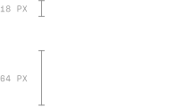
Horizontal (Primary) Logo: A height of at least 18 pixels is recommended for optimal clarity on standard web headers.
Stacked (Secondary) Logo: A minimum height of 64 pixels is suggested for vertical layouts.
Clear Space
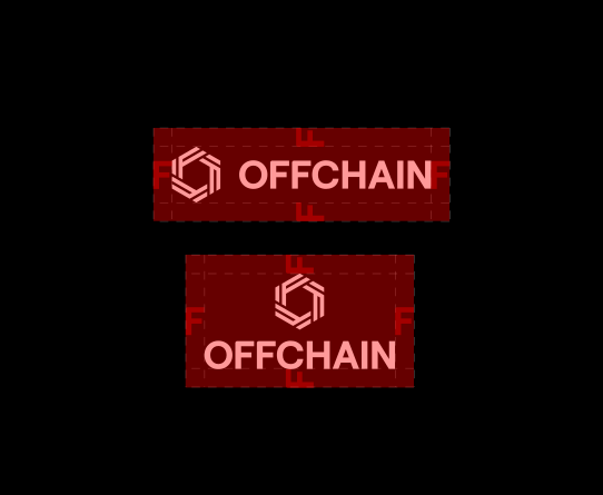
Primary (Horizontal) Logo: Use at least the width of the F from the wordmark as minimum padding on all sides.
Secondary (Stacked) Logo: Apply the same rule: maintain clearspace equal to the width of the F on every side of the logo.
Logo Don’ts

A. Do not rotate or flip the icon
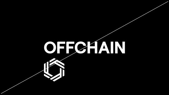
B. Do not rearrange elements of the icon into a new composition
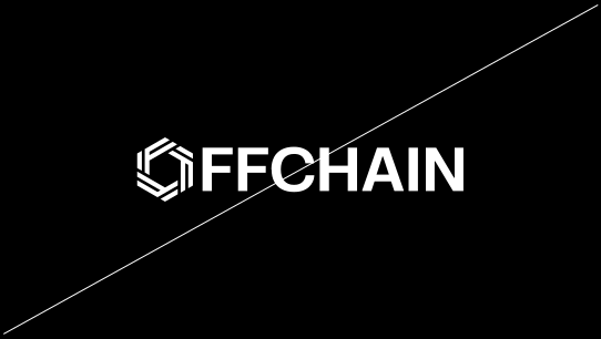
C. Do not replace the ‘O’ in Offchain with the icon
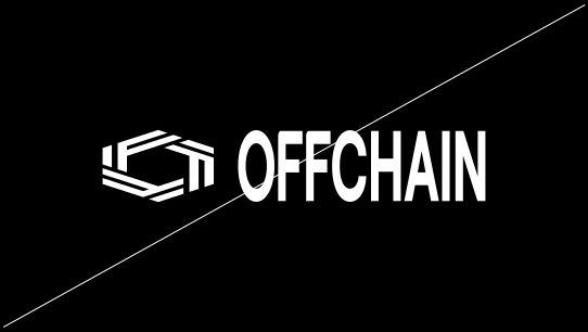
D. Do not stretch or squish the logo
Logo Do’s
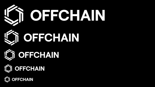
A. Do maintain the proportions of the logo as it scales in size
B. Do use a white logo on a black or dark background
C. Do use a black logo over a white or light background
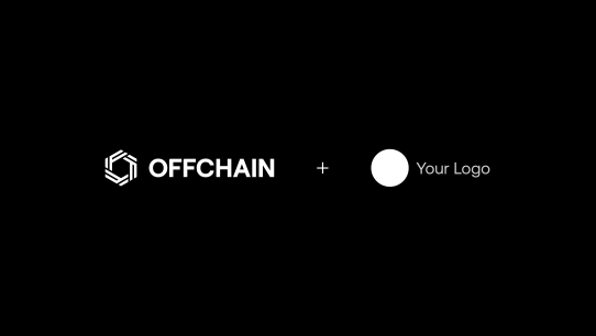
D. Do maintain a clear space between the two logos and use the most appropriate versions for a balanced visual.
Icon Minimum Size & Clear Space
Minimum Size

Maintain a height of at least 18 pixels is for optimal clarity on standard web headers.
Clear Space

Use at least half the height of the icon as clear space from other logos or graphic elements.
Icon Don’ts
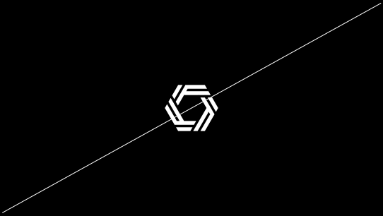
A. Do not rotate or flip the icon

B. Do not rearrange elements of the icon into a new composition
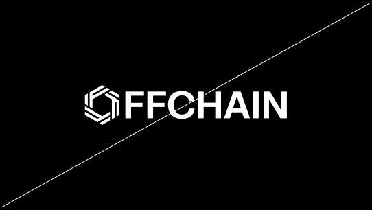
C. Do not replace the ‘O’ in Offchain with the icon
D. Do not stretch or squish the logo
Icon Do’s
A. Do maintain the proportions of the icon as it scales in size

B. Do use a white icon on a black or dark background
C. Do use a black icon over a white or light background
D. Do maintain a clear space between the two icons and use the most appropriate versions for a balanced visual.
Co-Branding Guidelines
We believe in the potential of brands when they come together. Utilize co-branding as a strategy to enhance brand recognition for both parties involved. The preferred color treatment is the primary horizontal logo version.
Preferred primary horizontal logo co-branding layout

Spacing with ‘+’ or ‘x’: The distance between the logos is 2x the width of the icon. Logos are middle aligned. Use the top and bottom as a guide and scale the logos in the same manner. Ensure that the two logos are visually balanced.
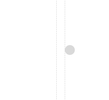
Spacing: The distance between the logos is 1x the width of the icon. Logos are middle aligned. Use the top and bottom as a guide and scale the logos in the same manner. Ensure that the two logos are visually balanced.
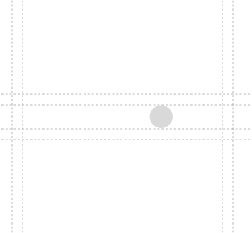
Clear space: For both of the previous examples, the clear space for the co-branding logos is defined by half of the width of the icon and then applying that measurement equally to all four sides of the logo lockup. Please help ensure a clear space within this area.
Vertical logo co-branding layout
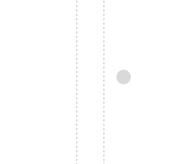
Spacing with ‘+’ or ‘x’: The distance between the logos is 2x the width of the icon. Logos are middle aligned. Use the top and bottom as a guide and scale the logos in the same manner. Ensure that the two logos are visually balanced.

Spacing: The distance between the logos is 1x the width of the icon. Logos are middle aligned. Use the top and bottom as a guide and scale the logos in the same manner. Ensure that the two logos are visually balanced.
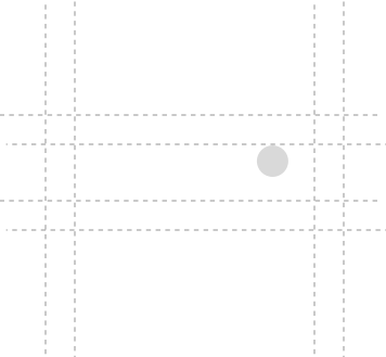
Clear space: For both of the previous examples, the clear space for the co-branding logos is defined by the width of the icon and then applying that measurement equally to all four sides of the logo lockup. Please help ensure a clear space within this area.
Co-Branding Don’ts

Don’t combine different logo treatments, such as using our stacked logo with a horizontal version of a partner logo.
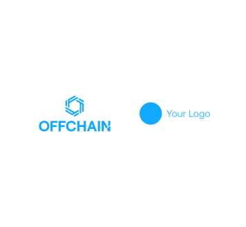
Don’t apply your brand color to the Offchain logo.

Don’t scale logos to make one significantly smaller or larger than the other, as it will result in an unbalanced visual.
Primary Palette
The primary palette is simple and utilitarian: black and white. These colors form the foundation of all brand applications, ensuring maximum clarity, contrast, and legibility.
HEX#000000
HEX#FFFFFF
Secondary Palette
Offchain’s color palette is primarily monochromatic — black and white form the foundation of the brand. A rainbow gradient exists as an accent but is used sparingly, reserved for special applications where a subtle pop of color is appropriate. Clarity and legibility always take priority.
HEX#282828
HEX#BFBFBF
HEX#E8E5E2
HEX#F4F4F4
HEX#0041F7
HEX#23E7FE
HEX#52F91B
HEX#FEE609
HEX#E76E01
HEX#F76674
Legal
These guidelines explain how you must use and visually present our brand assets at all times. Your use of our brand assets indicates your acceptance of these guidelines, and you understand that your use of our brand assets in violation of these guidelines will result in automatic termination of your license and/or permission to use our brand assets.
- Use of our brand assets must be expressly authorized in writing (including, in many cases, pursuant to the related product or service license agreement or similar arrangement).
- Your use must not mislead anyone about our sponsorship of, affiliation with or endorsement of your company or your products or services.
- Our brand assets are our exclusive property. All goodwill that results from your use of our brand assets will be solely to our benefit. You will not take any action that is at odds with our rights or ownership of our brand assets.
- Our brand assets must be used in a respectful manner. Our brand assets may not be used in a way that harms us, our products or services, or in a manner which, in our opinion, lessens or otherwise damages our reputation or the goodwill in our brand assets.